This post may contain affiliate links. Please read our disclosure policy.
It feels like I have been waiting forever to finally be able to share my (super tiny) master bathroom makeover!! I planned for months, and it really paid off. I am thrilled with the final results. It’s been a while since I shared my small bathroom inspiration, so here it is in case you missed it.
As I shared in my kitchen reveal, I hired a contractor because the work that needed to be done was just too intense for me to DIY. And quite frankly, I was impatient and wanted it done quickly. Thankfully I found a contractor who’s sister is a good friend of mine, which made it much easier to trust him.
So how about I just let the photos do the talking? I’ll do a little explaining along the way as well, and there will be a source list at the end.
Here is the bathroom before:
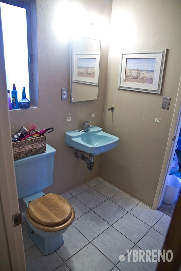
It was blue. Very, very blue. It was like blue was all you could see.
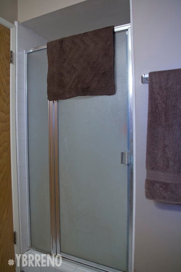
The white tile was grungy on the floor and the shower and there was literally NO storage whatsoever. The shower was also super small. I’m kicking myself for not getting a photo of the inside so you can see just how small. The width of the door was the width of the shower. It was basically a short square box.
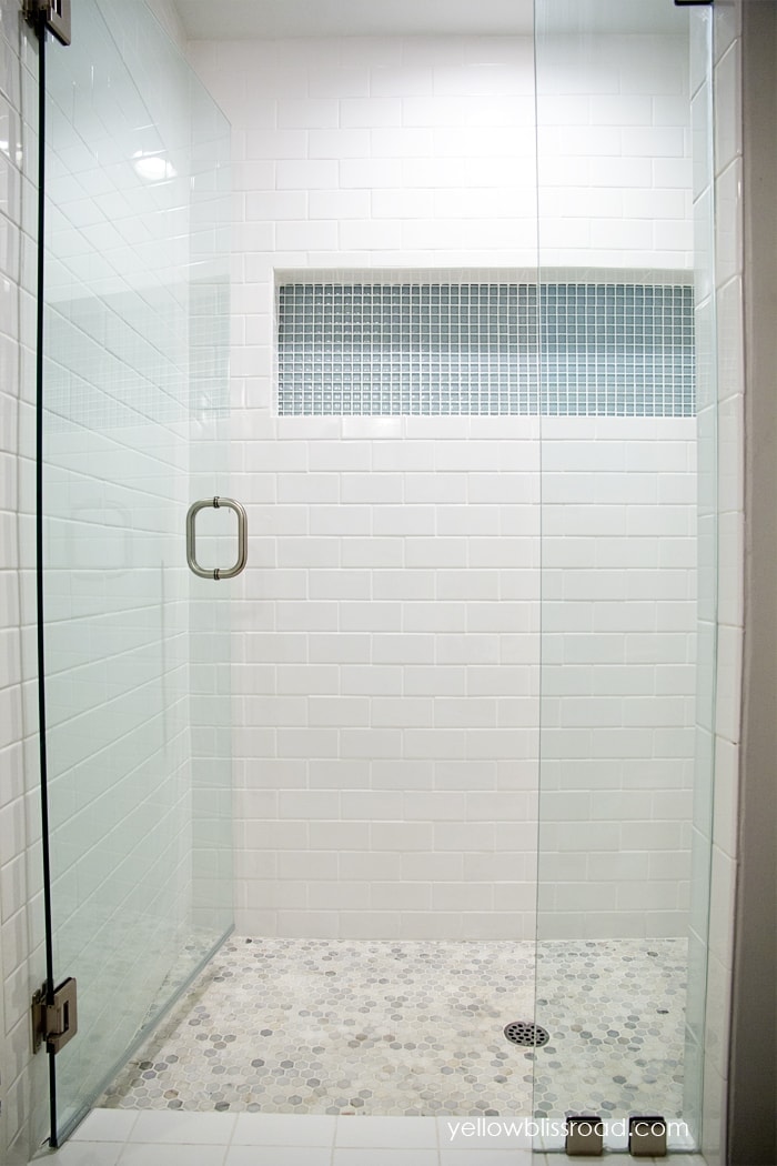
Well here’s the NEW and IMPROVED and much LARGER shower!
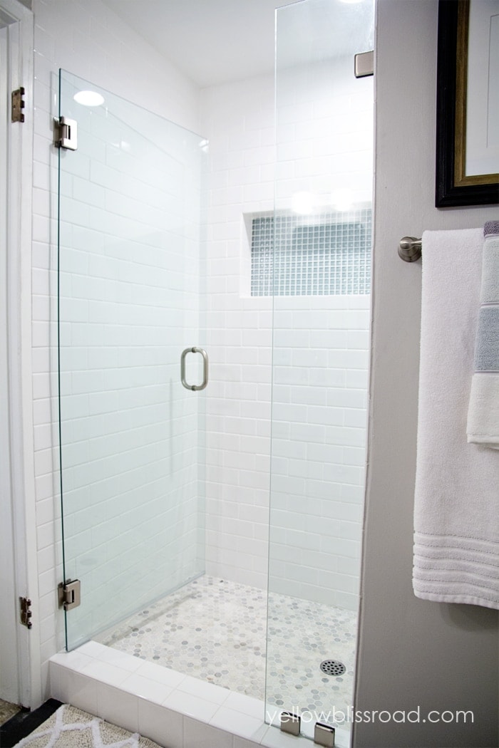
I literally had to remove the door in order to get photos, the space is that small. Try to ignore the rusty hinges, it’s the one thing I haven’t swapped out yet.
On the other side of the shower wall was a linen closet. It had a small top cabinet and a small bottom cabinet, and a shelf in the middle that pretty much had become a junk catch all landing space. This photo is from our other bathroom. On the other side of that cabinet is the shower.
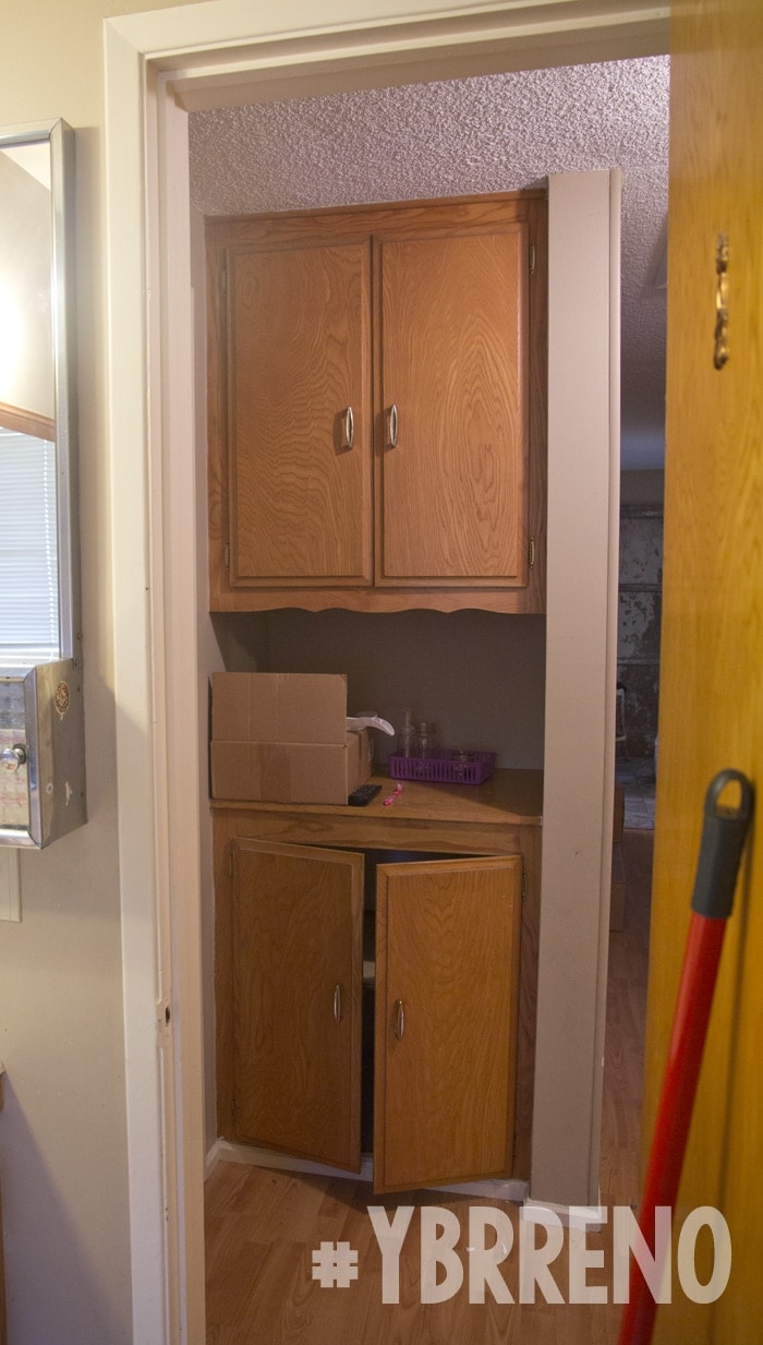
I decided to remove the cabinet and punch out the wall to extend the shower, increasing it’s size by a good two feet. I also knocked out the soffit above to raise the shower roof by about six inches. It was quite the project and was very intense, but quite possibly the best decision I made in the whole remodel. The width of the wall where the towel bar is, is the depth that we added.
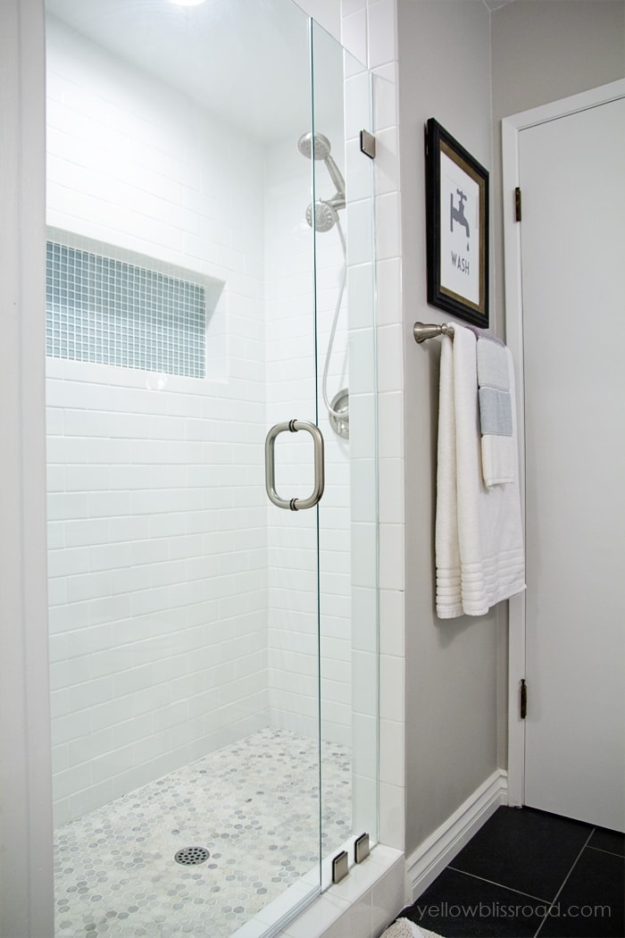
As with the kitchen, the entire bathroom was gutted down to the studs. Everything was replaced. I added a nice custom built in shelf, almost the full length of the shower wall, and I love that it gives a nice color boost.
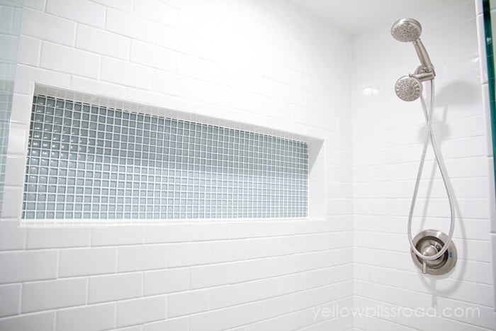
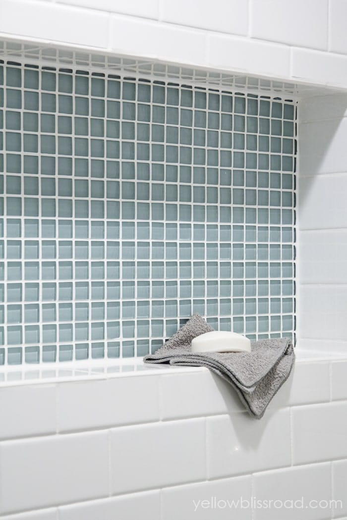
The frameless shower door was definitely a worthwhile expense. I chose to go with the clear glass so I can the beautiful shower!
I picked the biggest vanity that would fit in the space, but in hindsight I might have gone with the one a few inches smaller just so it’s not so overpowering. Either way, it provides the much needed storage that was seriously lacking.
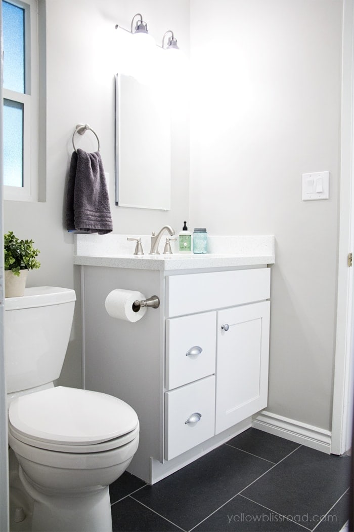
I had really wanted and planned to have the countertops match throughout the house, from the kitchens to the bathrooms. But as it turned out, there wasn’t enough of the kitchen countertop I had fallen in love with to supply both bathrooms. So I had to choose something different and I’m so glad I did. I wouldn’t like this quartz countertop in the kitchen because it’s a little too blingy, but it is absolutely perfect in the baths.
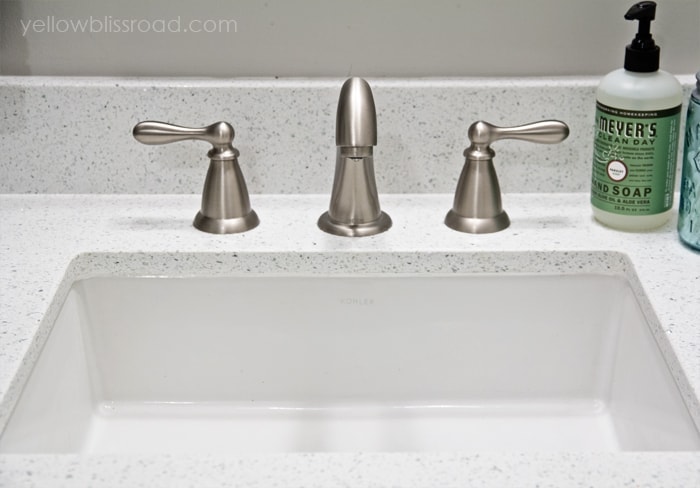
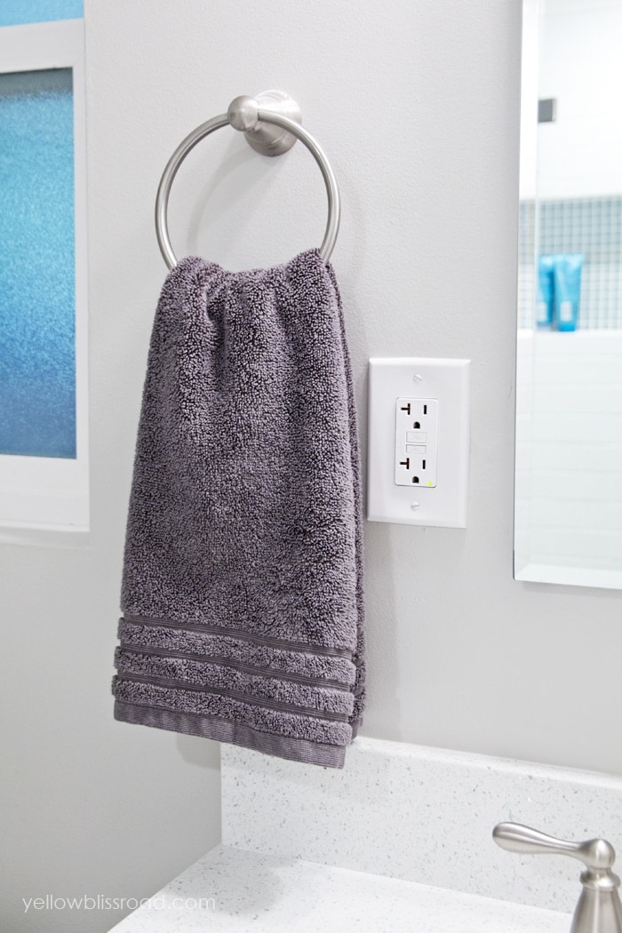
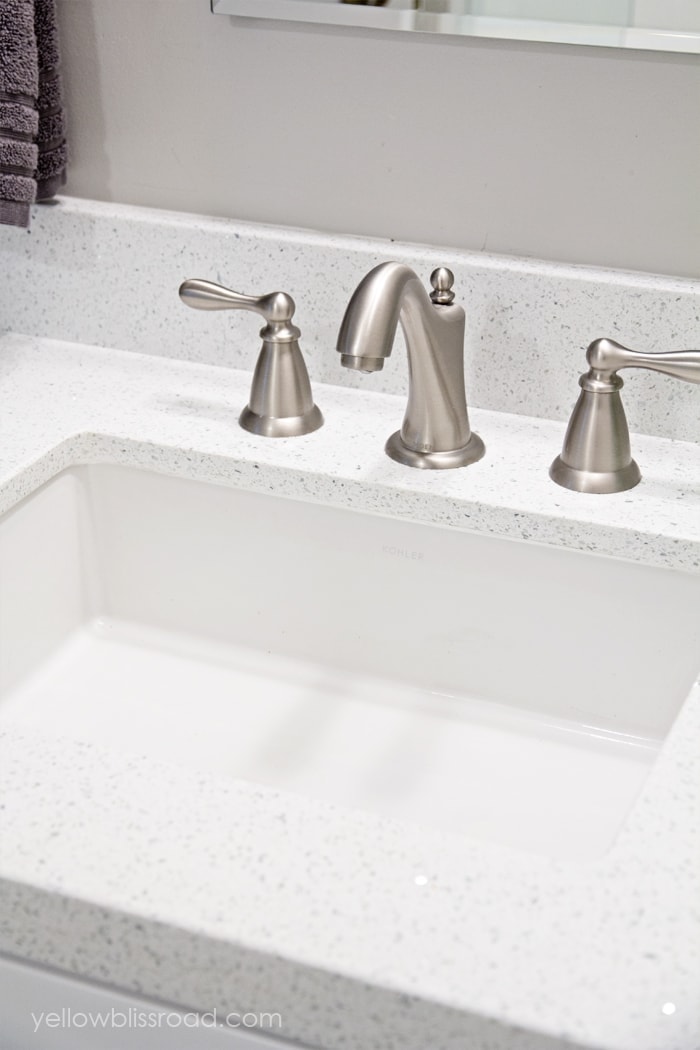
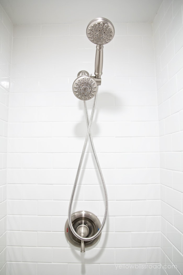
The fixtures throughout the bathroom were supplied by Moen, and I have to say I really do love them. They are a mixture of Caldwell and Banbury lines, and they are all made of spot resist brushed nickel. They really do resist those water spots, plus they are just so pretty to look at.
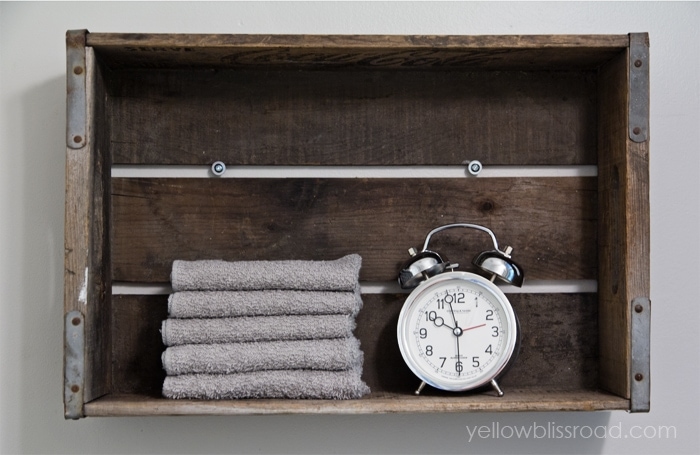
With all the modern, fresh updates, I wanted to warm the space up a bit, so I added some of my own rustic touches with my Coca-Cola crate that I attached to the wall as a shelf and my favorite vintage jars and bottles.
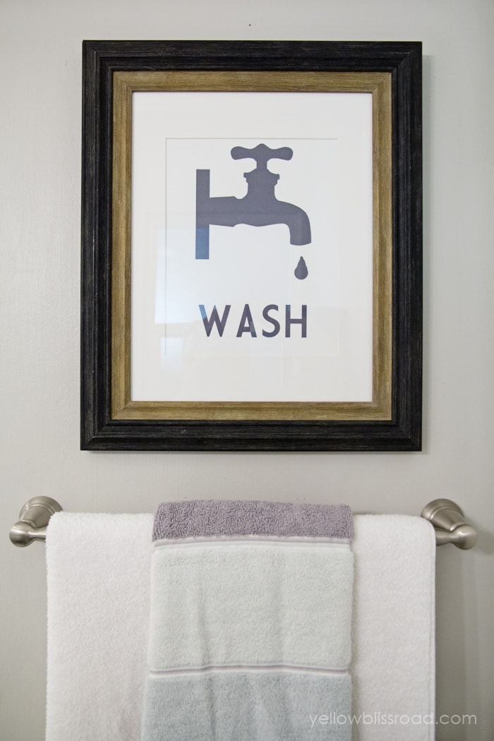
I also really wanted to design a pretty graphic for the space, but in the end I didn’t like anything I came up with. I fell in love with this print from Design, Dining and Diapers. Taryn and I seem to have similar styles which meant that this was perfect for me.
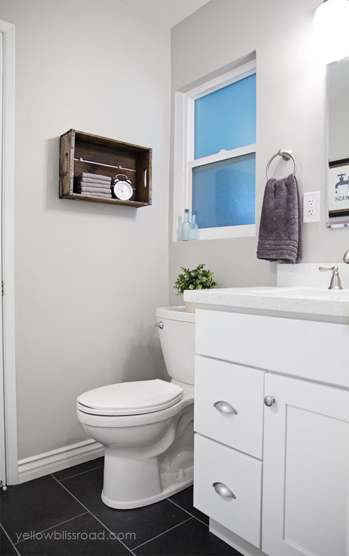
There are so many things I love about the space. It all works so well together and I am proud of myself for pulling it all together.
Small Bathroom Makeover Source List:
Wall Paint: Provided by Sherwin-Williams Repose Gray (a really pretty, not too warm gray)
Trim Paint: Provided by Sherwin-Williams Extra White (straight out of the can white)
Cabinets: Koville (purchased locally)
Floor Tile: Porcelanosa
Subway Tile: White by Daltile
Counters: Sparkling White by MSI
Cabinet Hardware: Provided by D Lawless – Knobs / Pulls
Lighting: Wayfair
Faucet, towel bars and TP holder: Caldwell by Moen
Shower Fixtures: Banbury by Moen
I did extensive research on Consumer Reports and other sites when choosing these pieces, and each of them are very highly rated.
(affiliate links)
Sink: Kohler
Toilet: American Standard
I was provided some of the products as listed above. All opinions are 100% honest and my own.
Be sure to check out my kitchen remodel!


I love your bathroom. We did the same subway tile in our bath but I am finding it hard to keep the grout clean (since it is so light ) . Have you run into that problem?
We actually have moved since updating this bathroom so I only had it for 2 years. But yes, the white grout can be difficult. A good bleach based spray always helps.
Where did you get your shower door from?
My contractor found it from a local supplier he works with.